We all have unusual relatives. You know the ones. You try to avoid them at family gatherings. Sure, sometimes they can provide a good story or an entertaining observation. But, in general, you know how to manage them. When you see them coming, you head for the kitchen to wash the dishes.
Unfortunately, we aren’t always as good at managing relative data. Relative data are those calculations and metrics that summarize and simplify a data set. Often, we use this data as the basis for further analysis rather than going back to the source. That’s a mistake.
Consider this example. Two baseball players are competing for the league’s batting title. In the first half of the season, Player A has a higher batting average than Player B. Then, in the second half of the season, Player A once again hits for a higher batting average than Player B. Is it possible for player B to wind up with a higher battering average for the season as a whole?(from John Allen Paulos’ book, Innumeracy)
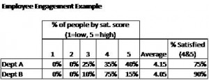
Before answering, think about this other example. You have two departments in your company. Department A has employee satisfaction of 4.15 and Department B has employee satisfaction of 4.05. Is it possible that Department B has more people who are satisfied?
The answer to both questions is “yes”. (for an explanation, see graphics at end of the article)
Did those answers surprise you? If so you might be falling into the common trap of taking the average of one or more averages. The distribution and number of data points in each sample makes a difference when “rolling up” data. Averages omit information about either of those. Taking the average of a set of averages results in being two steps removed from the original data. A lot of information can be lost. We all learned this lesson playing the telephone game in school. The further you get from the source, the less reliable and useful the information.
I recently saw another example of the misuse of relative data. An author claimed that lower employee engagement can lead to a 300% drop in shareholder value. This was based on data showing that companies with higher than average employee engagement, had a 10% greater return on shareholder value than average. Companies with lower than average employee engagement had a 20% lower return on shareholder value.
This conclusion is misleading. The real drop in shareholder value is 30%, the difference between the two percentages.
It’s true that a loss of 20 cents is 300% less than a gain of 10 cents, but that’s a different issue. While technically correct, it’s misleading – especially when presented as the “drop” in value. It’s not the drop in shareholder value, it’s the percentage difference between the percent differences in shareholder value. You are now two steps removed from the original data.
The problem with using a relative comparison of a relative comparison is that it doesn’t really tell you anything. 300% sounds like a spectacular difference. However, the difference between one and four is also 300% as is the difference between .01 and .04. Each of those changes implies something very different in terms of the actual impact on shareholder value. What you care about as a leader are the actual changes and how they compare.
Use caution when working with relative numbers or numbers that are representations of data. They are fine for getting a quick read of your data. However, using them as the basis for further calculations and analysis is risky. You quickly lose meaning and understanding of the original data set. To deepen your analysis, go back to the original data.
——————————-
Illustration of baseball and employee engagement examples
Brad Kolar is the President of Kolar Associates, a leadership consulting and workforce productivity consulting firm. He can be reached at brad.kolar@kolarassociates.com.


